
Hey Folks,
As part of my prep for 2018, over the past month or so I’ve been developing a new way to brand my covers. Specifically, the author name part.
Here’s the way my author name will appear on covers into the future:
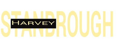 The background will blend with the cover. Of course, the font colors and the background behind my first name also are adaptable. You’ll see this in a cover below.
Branding is all about making your work easier for readers to find. That’s why one precept of cover design requires that, even in the thumbnail version, both the title and the author name should be readily visible.
Dean Wesley Smith and myriad others whose last name is much shorter than their first (or than their first and middle) have an advantage. When they line the names up right, the last name is prominent. (See any of DWS’ covers to see what I mean.)
I could do something similar if I added my middle name. But the font for my first and middle name wouldn’t be much smaller than my last name. The two combined, including the space between them, is only 13 characters. My last name is 10 characters all by itself.
But I don’t want to use my middle name anyway, so not a big thing. I just had to come up with some other way to brand my covers with my name to make my work easier for readers to find and recognize.
 When I first published the novel, The Consensus, here’s the cover I created for it. I felt something wasn’t right about it, but I was in a hurry, so I let it ride.
As you can see, both the author name and the title are very difficult to read. Partly that’s because of the font color, but it’s also because of the font choice (for the author name) and the font size. Notice too how “squeezed-in” the author name looks. It doesn’t look comfortable.
Recently I was looking over some of my published works online, and that cover slapped me. Ugh. And only a few days ago I finalized my new author name logo. So I decided to rebrand the cover on the spot. That’s it below on the left.
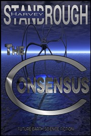 As part of the rebranding, I changed the font color to more accurately reflect the lighter color on the cover. I also increased the size of the title, and of course added the new author name logo.
What do you think? Is the cover better or worse?
So as I write off into 2018, I’ll also be rebranding the covers of my novels and novellas, and of course branding all my new work.
Back soon.
Of Interest
For those of you who listen to podcasts, check out “Smart Book Marketing Starts with a Solid Foundation” from Smashwords at http://blog.smashwords.com/2017/12/smart-book-marketing-starts-with-solid.html.
Linda Maye Adams, in her “2017 Writing Year in Review,” talks about several workshops she took from DWS. You might check it out at https://lindamayeadams.com/2017/12/30/2017-writing-year-in-review/.
Fiction Words: XXXX
Nonfiction Words: 490 (Journal)
So total words for the day: 490
Writing of “”
Day 1…… XXXX words. Total words to date…… XXXX
Total fiction words for the month……… XXXX
Total fiction words for the year………… 453762
Total nonfiction words for the month… 7700
Total nonfiction words for the year…… 183253
Total words for the year (fiction and this blog)…… 637015
Calendar Year 2017 Novels to Date………………………… 9
Novels (since Oct 19, 2014)………………………………………… 27
Novellas (since Nov 1, 2015)……………………………………… 4
Short stories (since Apr 15, 2014)……………………………… 182
The new version is definitely better! Great idea to make your last name stand out like that! And it is much more readable in the new colour.
It does seem a bit strange to have your first name kind of crossing your last name, though. I’m wondering whether you could maybe keep it just above the left part of your last name, or something else? And I guess it would be too long to fit in the horizontal bar of the T, which could be another way of incorporating it into your name?
But in any case, even with the slightly weird feeling of having it crossing your last name, it still feels much better to have it bigger, across the whole title.
On an unrelated note, the artwork made me think of Stranger Things (the new season). If I’m not the only one, I guess that would be a good thing if your book would appeal to the same type of public than the series, and not a good thing if it is in a very different genre.
Thanks. I experimented with having my first name only above on the left, but I can’t squish it much or it looks weird, and if it’s too large, the whole thing takes up too much space. I also tried having my first and last name all the way across above my last name, but again, same problem. Plus I don’t want to have to rebrand my entire persona with a whole different name. Finally, I also tried Harvey centered above the last name, with the center several letters of the last name a bit smaller to make room (and larger letters on either end), but that just looked weird. I’ll stay with this for now, but I’ll keep experimenting from time to time. Glad you like it.
I like the way your first name is embedded into your last. It sets the cover apart from the thousands of other authors out there. Great creativity, Harvey, and kudos for thinking outside of the box. The change in color definitely makes it more professional as well.
Thanks, Alison. 🙂
Gotta agree. This monkey goes for the shiny object. The new name logo works well, too. Your new year is off to a healthy, creative start. Let whatever’s inside flow onto to the page.
Thanks, Gary!